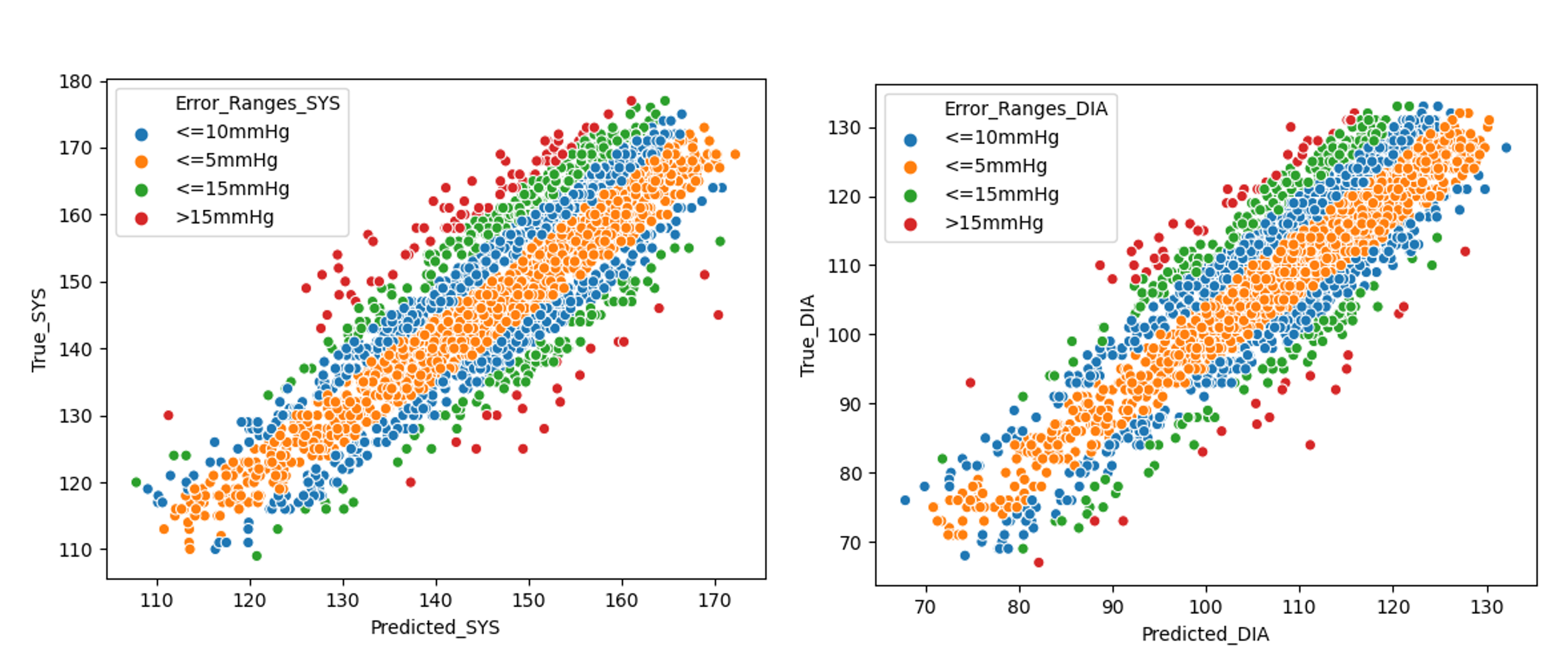
Project 1: Current predictions are very accurate and satisfy requirements to be recommended by the BHS as a hospital-grade blood pressure device
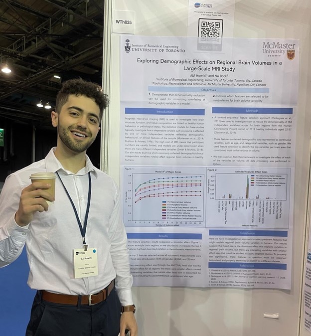
Aux photo: Me presenting Project 2 at OHBM 2022 Glasgow
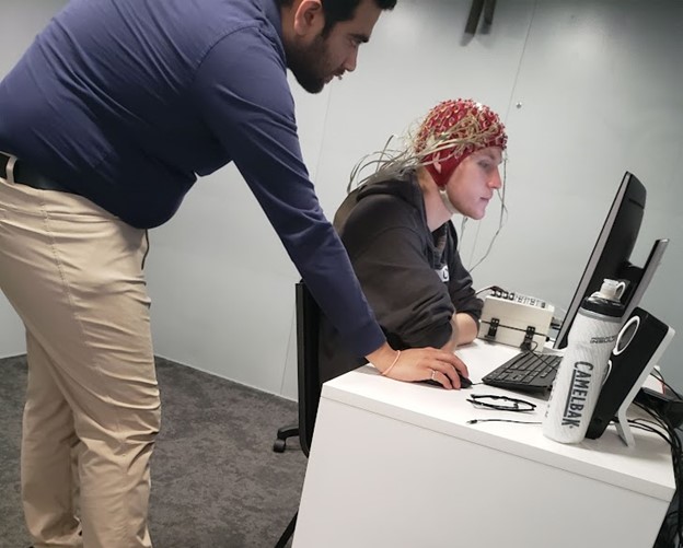
Aux photo: Testing EEG equipment in the Becker lab for Project 3
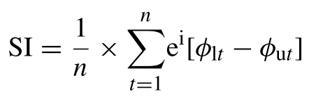
Project 4: Formula used for synchronization index, SI. φut represents the upper frequency power time series’ phase values at time t. The phase value of the lower frequency is φIt, and n is the amount of time points.
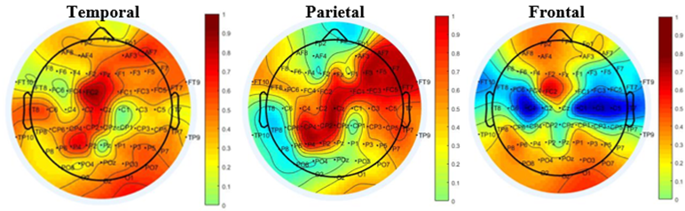
Project 4: Theta-gamma CFC SI values plotted using channels in the temporal (T7), parietal (P7), frontal (F7) lobes as high frequency.
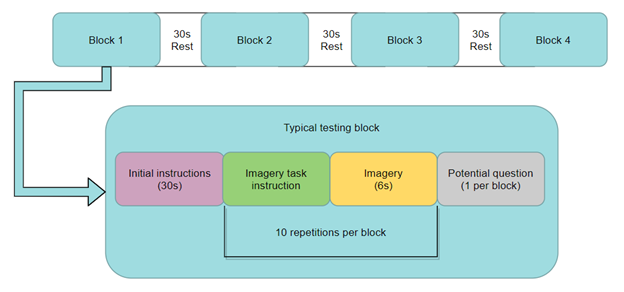
Project 3: The design of our offline BCI testing.
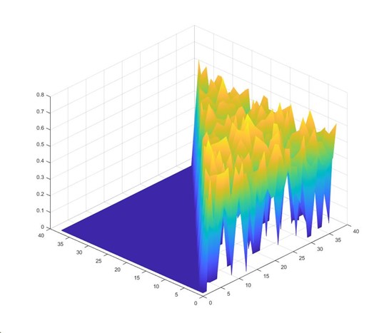
Project 3: The classification accuracies of all pairs of EEG tasks are plotted. The z-axis is classification accuracy normalized to a range of [0,1]. The x-axis and y-axis contain each numbered task. Tasks paired with themselves were not tested and were set with a default classification accuracy of 0.
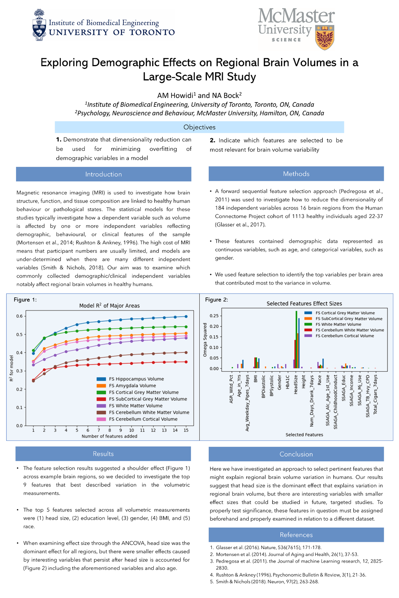
Project 2: Poster presented at Organization for Human Brain Mapping 2022 Glasgow.
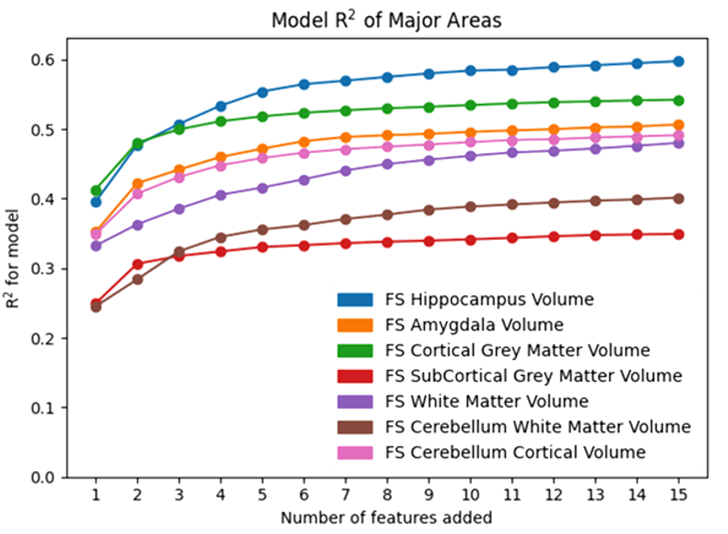
Project 2: Figure 1 from poster: Figure displays how after 9 features are added to a model, the model has a shoulder effect in variance explanation.
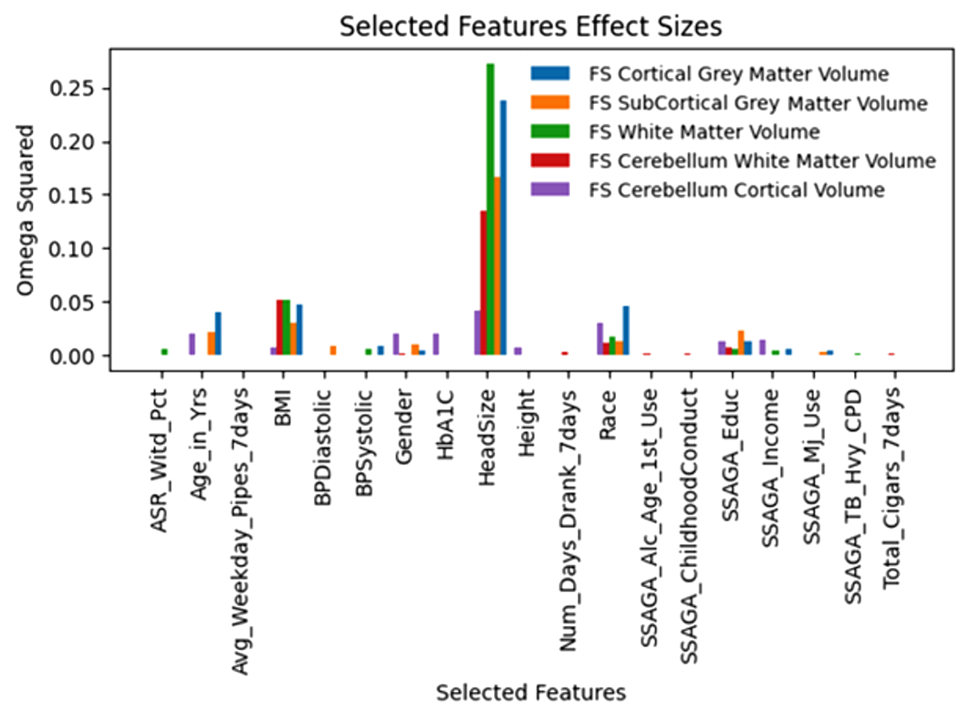
Project 2: Figure 2 from poster: Figure displays that other effect sizes are minimal when compared to Head Size in explaining healthy brain volume. It is important to note that different features were selected for different brain areas, and the effect sizes of different features vary depending on brain area.
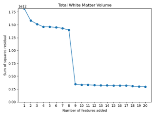
Project 2: graphs showing error residuals in varying ANOVA models as more features are added
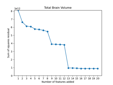
Project 2: graphs showing error residuals in varying ANOVA models as more features are added
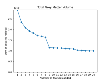
Project 2: graphs showing error residuals in varying ANOVA models as more features are added
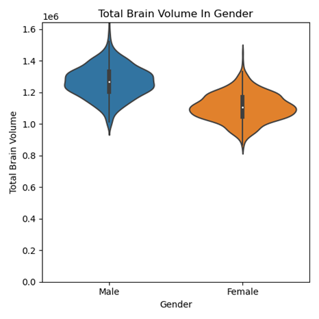
Project 2: Violin plot showing how total brain volume differs in gender. Previous literature reports similar findings. Our study shows that after normalizing for other features, gender has a minimal effect size on healthy brain volume.
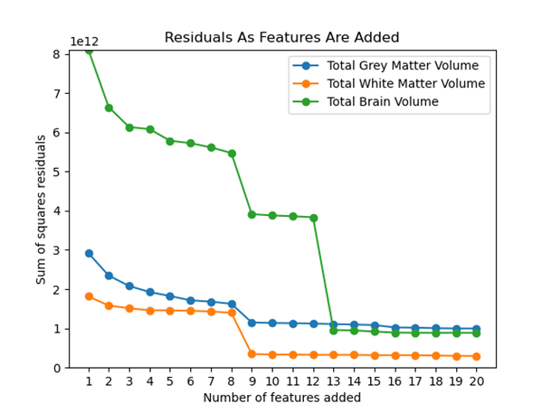
Project 2: Graph displaying how the residuals in different models are affected by increasing the number of features in a model. All the models have a significant increase in variance explained after 9 features are selected for.
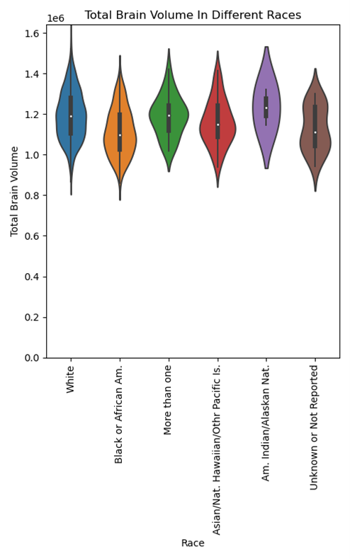
Project 2: A violin plot displaying how total brain volume differs as a function of participant race. Despite the plot not showing significant distribution differences, race was the most selected feature across the dataset and was among the 9 features selected for total brain volume. We believe this is because after accounting for other features, race can explain additional independent variance in brain volume.
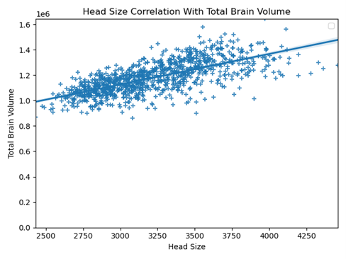
Project 2: Graph displaying the correlation between head size and total brain volume. A line of best fit is drawn to display the correlation between the two variables.